Arcade Game Typography
By Toshi Omagari
Read-Only Memory
Hardcover / 272 pages / £ 40
IN-GAME TYPOGRAPHY of the arcade age played a role similar to that of neon signs in decades prior: to grab the attention of passersby, define brands and products, and above all make a unique aesthetic statement within the limits of its technology. Arcade games had to not only stand out in dark rooms and corridors, they had to compete side-by-side against other games, and along with eye-catching cabinet designs and sound blaring through speakers, a game’s onscreen display – called “attract mode” – was its primary means of drawing in paying customers. Typography played an essential role in drawing in players and convincing them to spend that first quarter – and after they had done so, in displaying essential information, providing encouragement, and keeping score. For those with enough skills, the experience of entering one’s initials on a semi-permanent High Score screen provided the ultimate type-based endorphin rush.
Typographer and game fanatic Toshi Omagari had long felt a primal connection to the typography of his favorite games. Certain typefaces, like that of the psychedelic rail shooter Space Harrier, would evoke vivid memories of the game and gameworld just by their appearance, an effect he called “sensory shorthand”. While there were plenty of studies of the classic arcade age covering everything from its pixel art to its music to its coding and game development, there was no comprehensive study of its typography. He set out to document the era’s typefaces himself, and the Arcade Game Typography project was born.
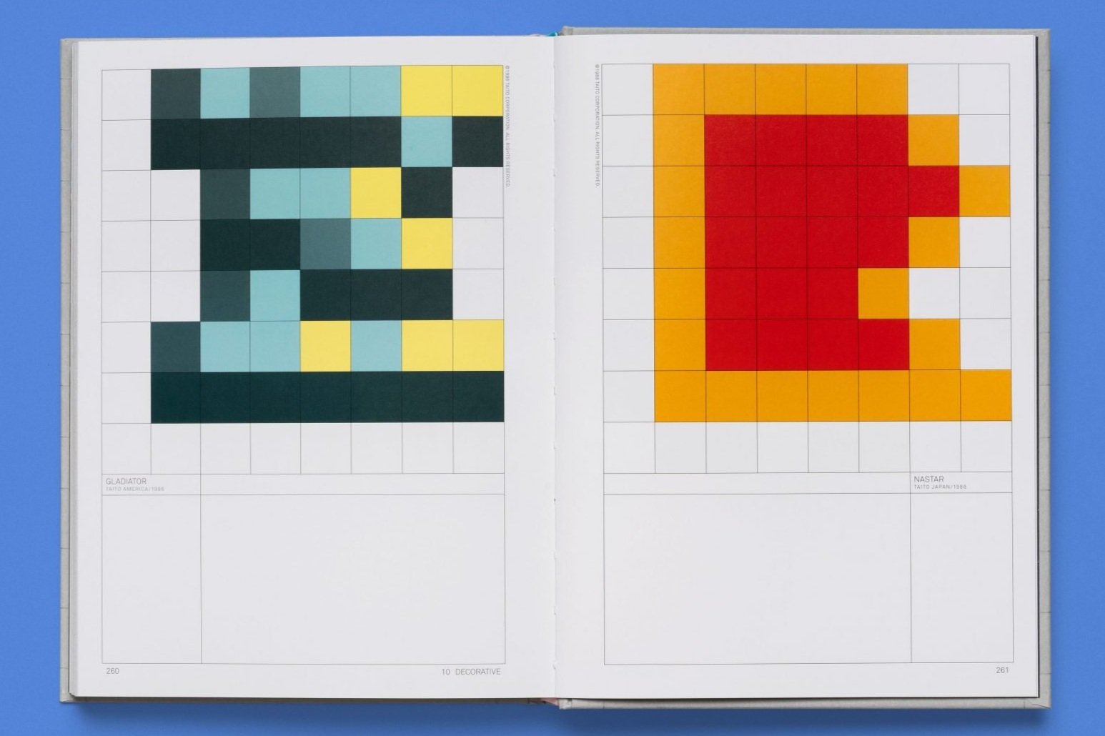
In the introduction and throughout the text, the book puts forward the idea of game letters as “characters” in multiple senses: the standard one, i.e. a unit of writing, as well as the broader game-based sense of objects, sprites, and controllable characters. In the arcade era, letters, like other programmed objects, took up “space” in a way they no longer do, requiring both the work of hand-crafting them piece by piece and a substantial chunk of the game’s limited memory. Each typeface added to a game (with some having numerous typefaces used on different screen types, such as the ubiquitous High Score screen) was the work- and memory-equivalent of adding a small army of enemy soldiers or spaceships.
While memory was often conserved by dropping unused letters (many typefaces in the book are missing J’s, Z’s, and other less-common English characters), the programmers made up for this with wildly creative and colorful examples of type design, made all the more impressive by the technical limitations of the era. The necessity of programmers to build their own typefaces pixel by pixel created a unique typographic ecosystem, which was occasionally influenced by traditional type design but also free to ignore it. As Omagari points out, “The lack of commercial interest in, and influence from, the computer type industry has resulted in a collection of beautiful art created by outsiders.”
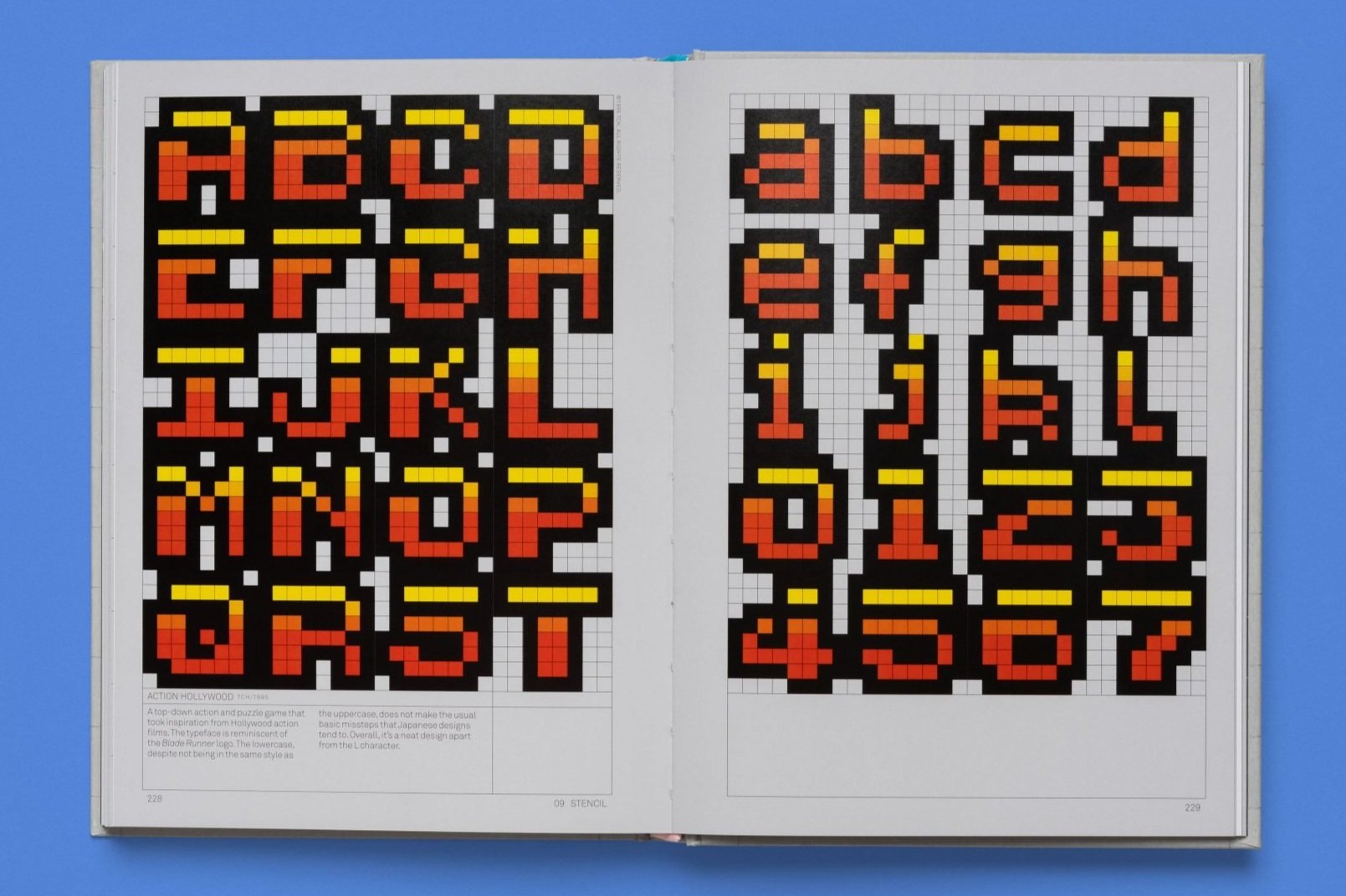
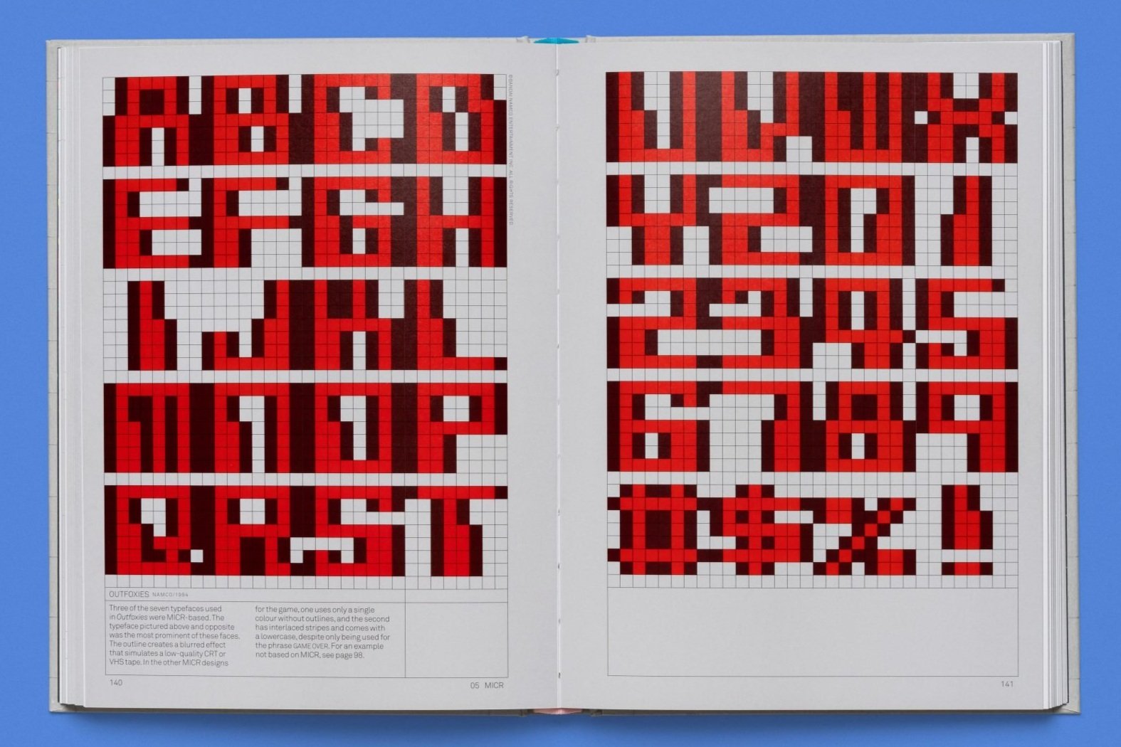
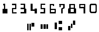
While a comprehensive survey of the entire range of arcade typefaces would be a near-impossibility, Omagari distills a dizzying range of games – a total, by his estimation, of over 7,000 – down to several hundred iconic examples. He starts by imposing strict rules on the project (8×8 pixels, monospaced, Latin alphabets only), reducing the potential pool substantially. From there, he sorts the pixellated type into families such as Sans, Calligraphy, and MICR. The latter, which stands for “Magnetic Ink Character Recognition”, describes typefaces that mimic the robotic-looking, machine-readable lettering of the early digital age, perhaps best known in the 21st century as the strips of numbers at the bottom of bank-issued checks.
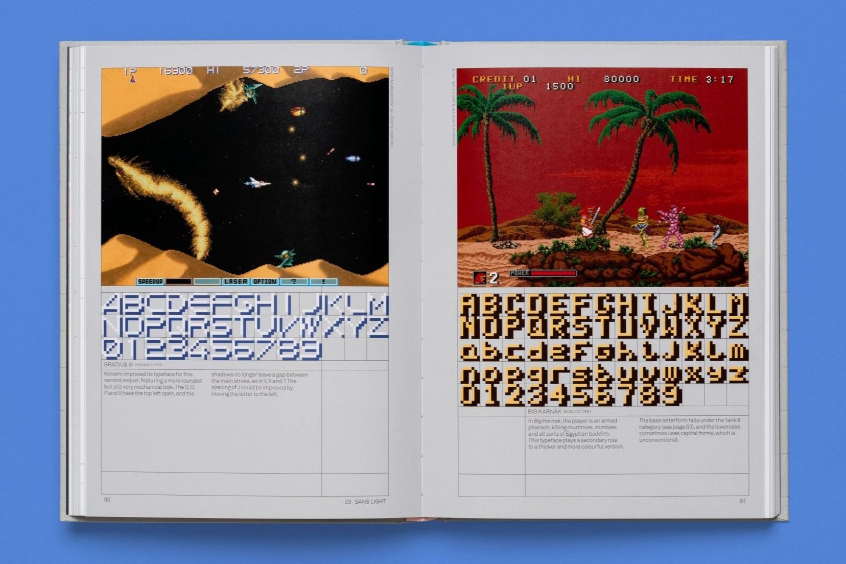
Between these sections, which feature letters on their 8×8 grids at various levels of magnification, are essays on subjects such as “The Atari Font”, the primitive 1976 pixel font that served as the basis for countless later ones, “Peculiar Characters”, on the countless symbols and glyphs that were included with these character sets.
“The lack of commercial interest in, and influence from, the computer type industry has resulted in a collection of beautiful art created by outsiders”
In your Preface, you say that Arcade Game Typography is intended for both game and typography buffs, communities whose members may not necessarily have extensive knowledge of each others’ fields. Do you see similarities between fans of games and students of typography?
I think there is an overlap between the two fields; even though I said I had two separate groups of readers in mind, I didn’t think they would be far apart. Video game industry needs more typography experts, so I wish the overlap increases.
While it can be tricky to separate the aesthetics of arcade fonts from the nostalgia they evoke, there is an undeniable presence and rawness to them, as well as a certain timelessness despite their “retro” aura. Do you feel something has been lost in the progression toward ever-cleaner and higher-resolution graphics?
While the appeal of retro aesthetics may be the brutalism of chunky pixels and nostalgia for many people, I personally love it when it’s pushed to its limits. You could see amazing pixel arts and typefaces from the 32 bit era, and I think this pinnacle of pixel art seems lost a bit.
Even in games like Owlboy and Enter the Gungeon, the in-game typefaces seem to come from older and simpler times: no colour, graphic effects, or animation. I wish I could see the resurgence of that.
Do you have a favorite arcade font, or one you consider the foremost example of creativity within the restrictions of an 8×8 grid?
My usual favourite is the script typeface from Sky Fox. Its use of grey as sub pixel, the way each letter fits naturally to the square format, and the juxtaposition against the horrible game content.
Another favourite is from DanceDanceRevolution – 3rd Mix for its top-heavy letterforms and luxurious use of colour.
What projects are you working on currently?
I cannot talk about most of my latest projects, but I have recently worked on the typeface for the upcoming strategy game called Inkulinati. I wish to do more video game fonts in the future!
For those in London, Toshi Omagari will be speaking at the Centre for Computing History on April 1. To learn more about his past and current projects, check out his official website and follow him on Twitter.